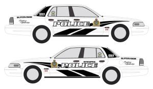
So the WPS appears to be headed from blue and white to black and white.
According to former dep. chief Menno Zacharias, the Winnipeg force is soliciting opinions from officers about their preference for a new design and colour scheme on their mobile offices.
I think I like it. The black on white — especially with the ‘swoop’ logo — looks cool and powerful to my eyes. My only wish is that they were moving to the Dodge Challenger as the model for the cruisers.
The proposed new slogan/motto, however: ‘Building relationships’ – I don’t know about. It sounds good in theory, but in practice?
Let’s put it this way. If the force is so concerned about forging positive relationships with the public, why don’t they get a say in what the new design looks like?
According to Zacharias, its police officers [and possibly civilian members of the force?] who get to weigh in on the plan.
After all, it’s their tax dollars at work to pay for the initiative in the end.
It also would have been a simple and easy way for the WPS to reach out to the public and — as Chief McCaskill always says at least once when the media’s around — ‘Start building those relationships.’
People love to feel included in things like this. No one’s saying the WPS has to listen to the public, ultimately — but at least remember it’s not just your officers who have to look at the cars as they swoop around the city.
[hopefully always viewing them from the outside, and never the back seat]
Come to think of it, I wonder where the idea for the new slogan came from? Hmm….
Kudos to Britt Harvey of the Winnipeg Free Press for a good look at this story in today’s paper.
[Update: My employer has also done a story on this with 2 interesting additions: 1st, any change to the WPS crest would require royal assent from the Queen – but more importantly about how the new design scheme would ‘improve officer morale.’ Next, each car will be equipped with an Apple laptop.]
Anyone else agree that WPA president Mike Sutherland’s comments in the FP seem strange? He indicates the cars’ new colours will be more visible and improve officer safety.
I thought it was those flashing lights and sirens that did that.
Hard to miss them, even on today’s blue and white cruisers.
{Update 2 – blogger John Dobbin agrees with me. The public should be consulted]
“It also would have been a simple and easy way for the WPS to reach out to the public ”
I admit, in my asleep-before-noon mind, I read this was “an easy way for the WPS to reach around to the public.” There’s one way of building relationships…
Personally, not a fan of the black’n’white. For some reason, it looks… American to me. Which is probably just how my brain parses “familiar yet different,” but I like my cuddly ol’ WPS designs.
“This is the colour scheme they used when I was growing up in the 80s. It was kind of cool…but very plain back then! Black car with white doors and the City of Winnipeg crest on the doors. Huge cherries on top, too! Anyone else remember?”
—-Via Facebook from Shaun McLeod